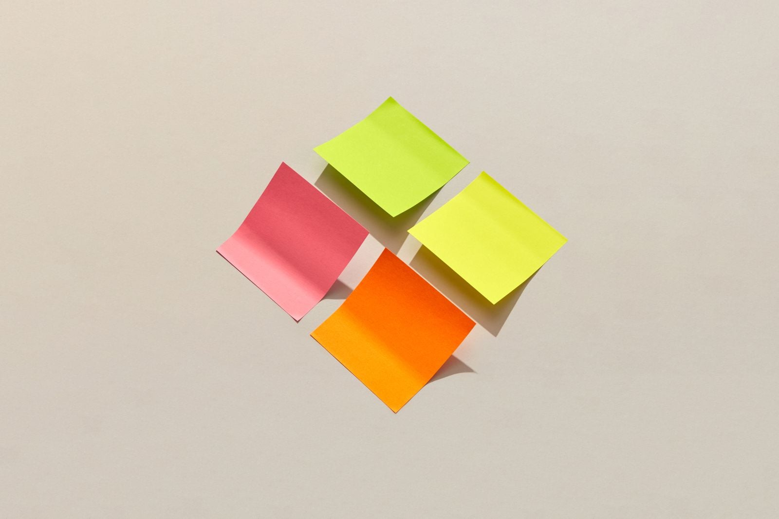
In 1963, Yale University Press printed 2,000 copies of a book that weighed 22 pounds, cost $200 (nearly $2,000 in today’s money), and came unbound in two enormous volumes with 150 silkscreened plates. The author, a 75-year-old German émigré named Josef Albers, had spent years handing his students coloured paper squares instead of paint and asking them to place one hue beside another, then watch what happened. The book was called Interaction of Color, and Yale News reports it has now sold well over half a million copies in at least 17 languages, ranking fifth among the Press’s all-time bestsellers.
The exercises inside look almost embarrassingly simple. With coloured paper, make one colour look like two. Make two different colours look alike. Make three colours look like two.
Try them once and the floor tilts.
The Artful Age
A weekly letter on aging well, family across generations, and the creative life after the kids leave home.

Why paper, not paint
Albers had run the design department at the Yale School of Art for nearly a decade by the time he retired in 1958 at age 70. He had already survived the Bauhaus, fled the Nazis in 1933, taught at Black Mountain College in North Carolina, and joined Yale in 1950. The paper-square method came out of a very practical problem: paint is slippery. A student mixing a wash can never quite repeat it, and the wet edge behaves differently from the dry one. Coloured paper is fixed. Cut a rectangle of a certain orange, lay it on a field of grey, and the orange is stable — what changes is only what the eye does to it.
That was the point. Albers wanted students to notice that colour is never a fact. It is a relationship.
Speaking to the Associated Press a few months after the book appeared, Albers put it about as plainly as it can be put: all colour perception, he said, is really illusional. That was the theme of the whole project.
The trick that convinced everyone
The most famous exercise asks you to make one colour look like two. You take a single strip of, say, ochre paper, cut it in half, and place one half on a dark maroon field and the other on a pale blue-green field. The two halves came from the same sheet. They are chemically, physically, measurably identical. And they look nothing alike. One reads warm and dense; the other reads pale and almost yellow.
Anoka Faruqee, associate dean at the Yale School of Art, notes that students often experience initial confusion when first encountering the exercises. She explains that students initially suspect the exercises involve tricks, but their skepticism transforms into excitement once they understand how color perception actually works.
The phenomenon is called simultaneous contrast. Michel Eugène Chevreul, a French chemist working with the Gobelins tapestry works, had described it in 1839. Albers’s contribution was not the discovery. It was the pedagogy — a way to feel it in your hands rather than read about it in a treatise.
A 22-pound book that was never meant to sell
The first edition of Interaction of Color was almost defiantly impractical. Two unbound volumes. 150 silkscreen plates, each printed to Albers’s exacting tolerances. A retail price so high that Yale Press ran advertisements insisting only 2,000 copies would ever exist. Albers cared about typefaces, line breaks, and printing techniques as fiercely as he cared about the exercises inside; at one stretch he and Press director Chester Kerr stopped speaking to each other over disagreements about the book as a physical object.
It sold out anyway. In 1971, Yale issued a paperback that put the exercises in student hands worldwide. That same November the Metropolitan Museum of Art opened a solo retrospective of Albers’s paintings — the museum’s first ever for a living artist. An iPad app followed in 2013, an eBook in 2020, and an interactive web edition in 2022; WIRED’s reviewer called the app “the gateway to an entire way of thinking”.
Nicholas Fox Weber, executive director of the Josef and Anni Albers Foundation, has described Albers’s passionate commitment to teaching others about color relationships as almost missionary in nature.
From Yale seminar rooms to the felt board
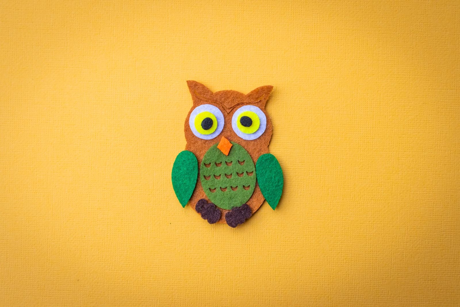
Walk into a well-equipped preschool classroom in 2026 and you will likely find a version of the same experiment sitting on a low shelf. A felt board with squares of primary and secondary colours the children can move around. A translucent stacking set — red, yellow, blue discs on a light table that overlap into orange, green, violet. A basket of paint chips organised not by shade but by neighbour. None of these materials cite Albers by name. The lineage is felt rather than announced.
The connection is not a stretch. Faruqee has noted that the book’s publication enabled Albers’s color teaching methodology to spread widely to schools globally. Colour theory in early-childhood classrooms used to mean a wheel on the wall and a lesson on primary versus secondary. After Albers, the emphasis shifted toward placement — put this beside that, and look.
A child at a felt board who moves a magenta square from a black background to a pale yellow one and gasps has, without knowing it, run one of Albers’s Yale exercises. The gasp is the whole curriculum.
Why the exercises land harder than a lecture
There is a reason the paper-square method outlives the textbook diagram. A wheel printed in a book is a claim you either accept or don’t. A paper square in your hand that appears to change colour when you slide it two inches to the left is not a claim — it is a betrayal by your own visual system, and betrayals are memorable.
This is also why the exercises work with three-year-olds and with graduate painters. The mechanism is pre-verbal. The retina and the visual cortex do most of the work: opponent-process cells adapt to the surrounding field, then read the target patch as its inverse partner. You do not need to know any of that for the trick to fire. You need only two pieces of paper and a steady light.
Adults who spend time with real materials — cutting, arranging, noticing — tend to report benefits that outlast the session. A 2024 study in Frontiers in Public Health, drawing on survey responses from 7,182 adults living in England, found that making art and crafting predicted higher life satisfaction, greater happiness, and a stronger sense that life is worthwhile. The Anglia Ruskin University team behind it reported that the lift to that sense of worthwhileness was as large as the lift from being in employment. The Albers exercises are a small, cheap way in.
The Bauhaus inheritance and the Mexican detour
Albers arrived at his method through a long route. He enrolled in the preliminary course at the Weimar Bauhaus in 1920 under Johannes Itten and later joined the faculty as a maker of stained glass, as the Rochester Institute of Technology gallery notes in its exhibition history. Stained glass is arguably the oldest simultaneous-contrast technology in the world: a red pane reads differently depending on the blue beside it, and cathedral makers had exploited this for eight centuries before Albers picked up a piece.
Then came Mexico. Between 1935 and 1967, Josef and Anni Albers made more than a dozen trips south of the border, visiting sites like Mitla, Monte Alban, Tenayuca, and Uxmal. Albers photographed obsessively — the steep stairs, the thickly framed doorways, the way sunlight cut a pyramid’s face into planes of hot and cool. The Guggenheim’s 2017 exhibition Josef Albers in Mexico argued that the Mesoamerican monuments transformed the rigorous colour theory he had learned and taught, pushing him toward the Homage to the Square series he began in 1950 and continued until his death in 1976 — roughly 2,000 works of nested squares, each one a colour experiment.
The paper-square exercises in his Yale classroom were the small, portable version of the same investigation. What does yellow do when green sits beside it? What does the green do back?
The uncomfortable side of the vocabulary
Albers’s vocabulary was borrowed from optics, but it was not neutral. While studying at Yale, the painter Tomashi Jackson noticed that the language Albers used in Interaction of Color — boundaries, mixture, purity, transparency, restriction, deception, placement, value — mirrored the language in transcripts of the school-desegregation cases Thurgood Marshall argued for the NAACP Legal Defense Fund, including the five cases consolidated as Brown v. Board of Education in 1954.
Jackson’s observation was not that Albers was writing about race. It was that the two vocabularies had grown up in the same American mid-century, one in a Yale studio and the other in federal courtrooms, and that both concluded the same thing: colour is not absolute, and what a viewer perceives depends on what sits beside it. One of Albers’s Yale students, Robert Reed, had been denied entry to graduate art programs in Virginia because of segregation that persisted after Brown. He went on to become the first Black professor in the Yale School of Art and its longest-tenured faculty member.
The exercises did not cause any of this. But the room in which Albers cut his squares was a room shaped by it.
What the felt board is really teaching
Back to the preschool. A four-year-old picks up a square of orange felt and places it on a field of red. The orange nearly disappears. She moves it to a field of blue. The orange leaps. She moves it back. She does this eight times, quietly, without narration from the adult in the room.
The quiet part is doing most of the work. An adult who narrates each step — see how the orange looks darker on the red? — hands over a conclusion the child was about to reach on her own. Albers’s classroom ran on the same principle. He set up the problem — make one colour look like two — and then let the paper do the teaching.
This is why the method survives when so much twentieth-century pedagogy has been quietly retired. It does not require the teacher to be an expert. It requires the teacher to hand over the squares and step back.
Sixty-three years later
Albers died in 1976, nine years after his last trip to Mexico, having spent the final quarter-century of his life making variations on the same nested square. Hyperallergic has described Interaction of Color as the most enduring element of his pedagogical legacy, still influencing students in architecture, design, and art. The Josef and Anni Albers Foundation continues to publish new companion texts, and Yale Press keeps the book alive in print, ebook, and interactive web forms.
Buy a pack of coloured construction paper at any stationery shop this week. Cut two identical rectangles of the same colour — any colour, it doesn’t matter. Set them side by side on the table. Then slide one onto a sheet of black, the other onto a sheet of white. Look for thirty seconds.
The two rectangles are the same. Your eye does not believe you.
That thirty seconds is the whole book.